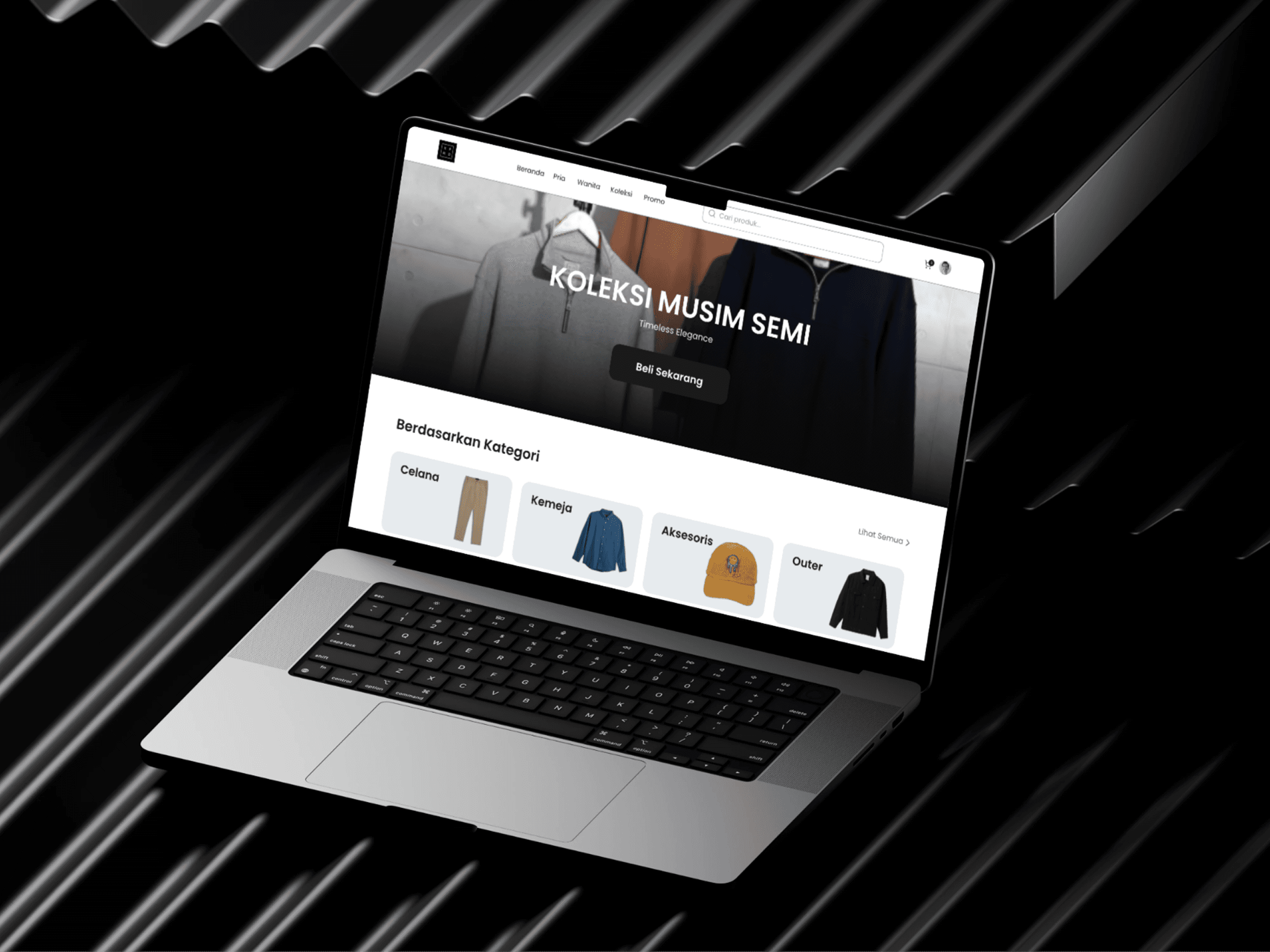
Furnihaus – Premium E-Commerce Web UI
Personal Exploration
[Introduction]
A premium e-commerce web design concept for "Furnihaus," a fictional high-end home decor brand. The primary goal of this exploration was to create an editorial, magazine-like shopping experience that elevates the product photography while maintaining a highly intuitive user interface for a frictionless checkout process.


[Description]
My Approach (Minimalism & Contrast)
When designing for luxury products, the interface should act as a quiet gallery rather than a loud billboard. My approach was to strip away unnecessary UI clutter and rely on a strict monochromatic color palette combined with generous whitespace. To create visual pacing and keep the user engaged, I implemented a dramatic transition from a clean, light hero section to a deep, dark lower section, effectively organizing secondary information without losing the premium feel.
Refining the Product Experience
The layout is meticulously crafted to balance aesthetics with e-commerce conversion best practices:
Editorial Hero Section: Features an asymmetrical image gallery alongside crisp, modern typography. The product options (Size, Finish) are designed as clean tactile buttons, leading to a prominent, high-contrast "Buy Now" CTA.
Immersive Information Architecture: The dark section elegantly houses secondary details such as Shipping, FAQ, and material specifications, using semi-transparent overlays to maintain depth.
Seamless Cross-Selling: The "You May Also Like" carousel is integrated flawlessly into the dark theme, using high-quality product photography to encourage further exploration and increase potential order value.